01
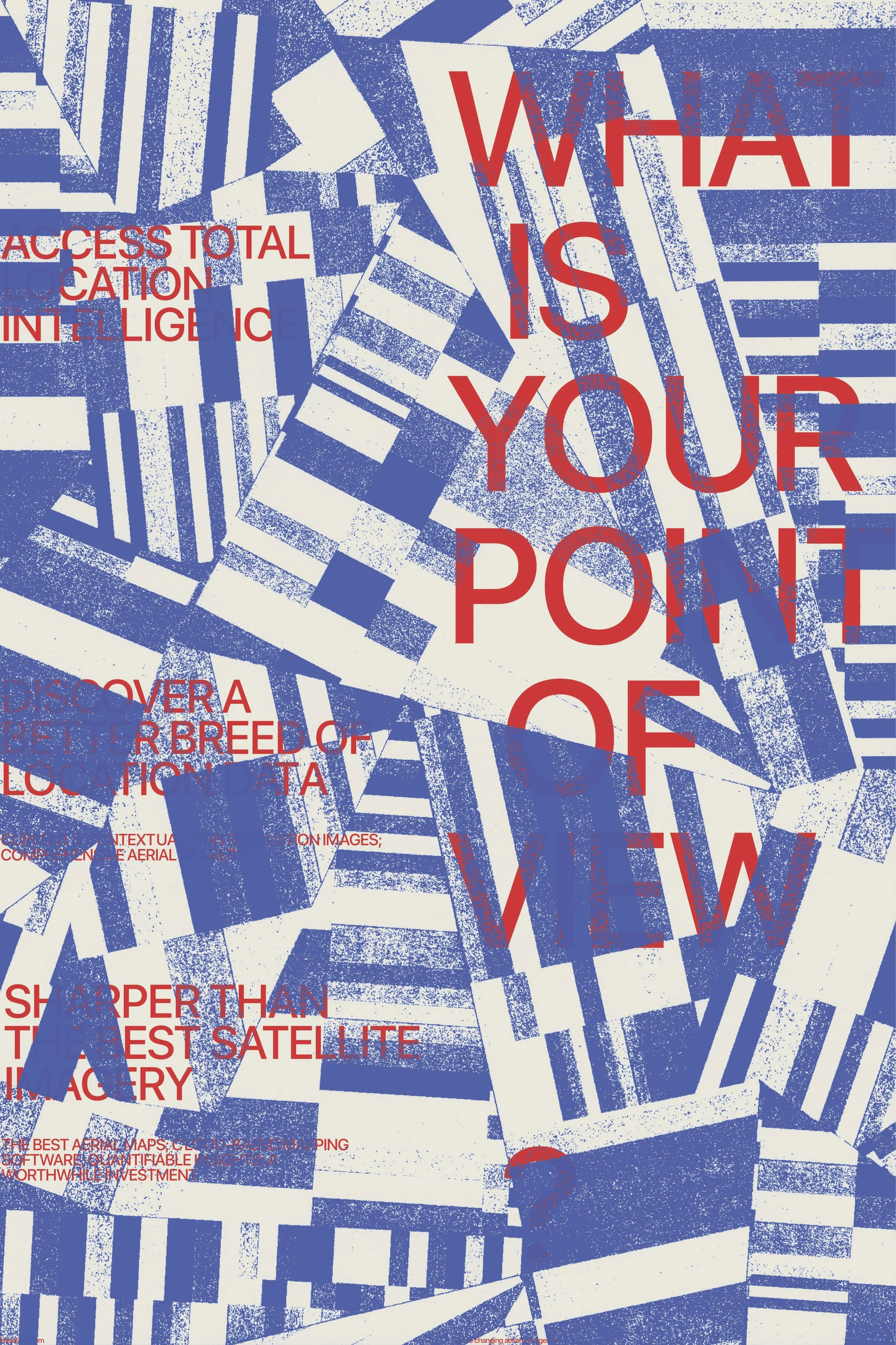
Type Fusion Poster
This project was initially inspired by my quilting research project, specifically a style of quilting called improvisational quilting. The original image I created for this poster was done analog: I printed many patterns of stripes, cut them all up, rearranged them, and scanned them back into the computer. The meaning for the poster was then assigned to it by a classmate, based on their own initial interpretation of it.


02
Comic Book Museum Rebrand
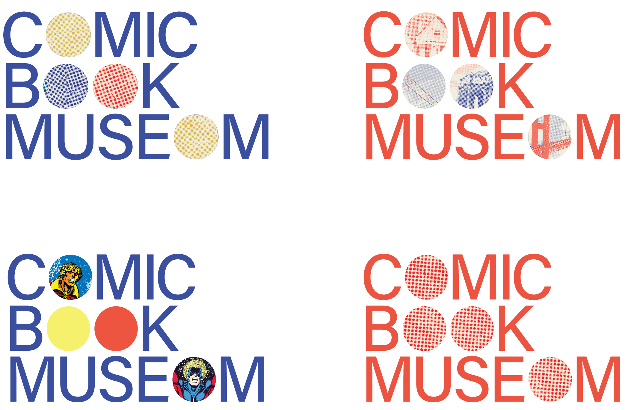
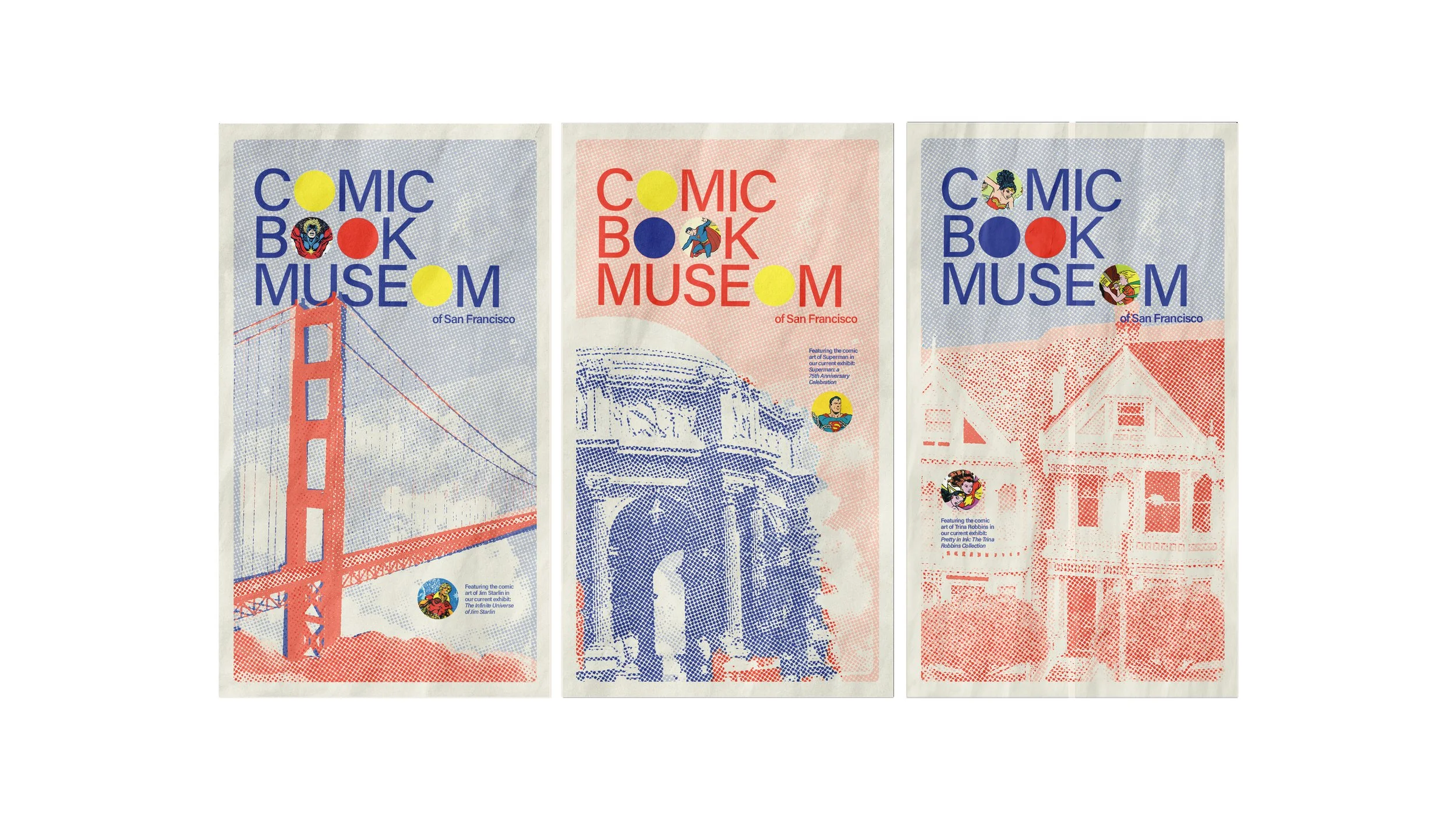
For this rebranding project, I chose to focus on select comic book motifs and incorporate them into the brand in a way that feels more contemporary. The logo identity itself was created initially to reference the familiar half-tone pattern that is so prevalent in comic arts. The ‘O’s are replaced with simple circles, which make this reference, but also symbolize an empty framework. The brand identity works revolve around this empty frame, which can remain flat colors or be replaced with imagery or patterns. These circles are much like the museum itself: a humble framework that lets the art inside take the spotlight.


03
Photo Booth Poster
As seen in the New York Times
I was commissioned to make this poster for Old Friend Photo Booth in New York City, New York. They wanted something illustrative but simple and clean. I created a custom typeface, as seen in the display type, that references vintage hand-painted signs of New York. The secondary type is written in oil pastel.
The poster is seen in the New York Times feature about Old Friend Photo Booth. You can see the article here.

04
Folio App
Folio is a digital bookshelf. Similar to Goodreads, Folio allows readers to document and share their reading habits and updates with their friends.
In creating this app, my goal was to create a user interface that was easy to explore and simple enough to let the book covers being featured lead the navigation.

05
Travel Series Book Covers
I designed these book covers as a complete set of three. Inspired by the cut out and collage designs of artists like Paul Rand and Corita Kent, I created these covers by cutting shapes and letters out of paper and then transferring into the computer. This analog process allowed for a more organic and adventurous feel to these beloved travel books.

01
Type Fusion Poster
This poster began as an experiment in form and was later assigned meaning by my classmates. The forms, which are somewhat space and technology-like, became a reference to a movie I love, 2001: A Space Odyssey.
01
Type Fusion Poster
This project was initially inspired by my quilting research project, specifically a style of quilting called improvisational quilting. The original image I created for this poster was done analog: I printed many patterns of stripes, cut them all up, rearranged them, and scanned them back into the computer. The meaning for the poster was then assigned to it by a classmate, based on their own initial interpretation of it.